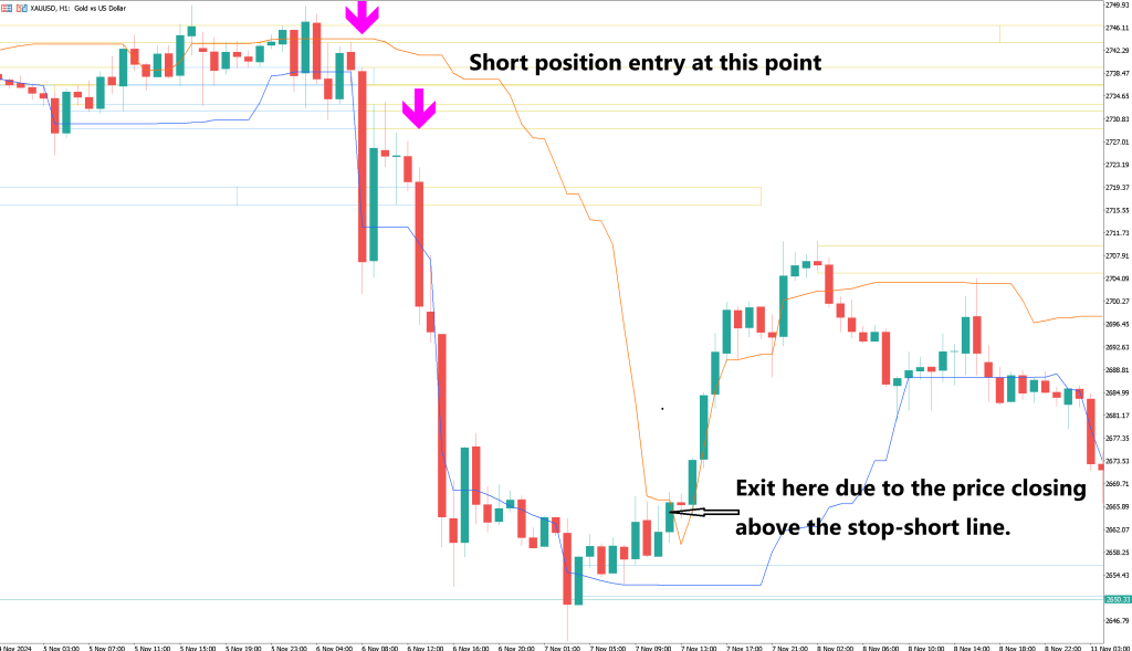
Learn about the Chande Kroll indicator, a trend-following indicator that uses average true range (ATR) to set stop-loss levels and highlight trend reversals. Ideal for traders seeking to align with market trends, this tool provides clear buy and sell signals and helps manage market volatility effectively.
Overview The Chande Kroll take profit indicator is represented by two lines overlaid on the price chart. These lines are calculated using true averages over a defined period to determine optimal stop levels that help prevent significant losses, especially in cases of market volatility or when a trend reversal is anticipated.
Background The Chande Kroll take profit indicator was initially introduced and subsequently applied in the book "The New Technical Trader," authored by Tushar Chande and Stanley Kroll. It is designed as a trend-following tool, helping traders determine their stop levels by utilizing the average true range of the prevailing trend, while also accounting for market volatility.
Formula The indicator is derived from calculating the average true range (ATR) of an asset's volatility in relation to market trends. Stop levels are set based on the highs and lows of the last "n" bars shown on the chart. The distance of these stops is proportional to the ATR over the "n" bars, and these calculated values are then applied to establish effective stop levels.
How to Use It The Chande Kroll take profit indicator can be applied in several different ways. A common approach is to sell when the price drops below both lines, and buy when the price moves above both lines. Another technique involves initiating trades when the two lines intersect each other.
As the price starts moving sideways, the Chande Kroll Stop lines tend to flatten, creating more space for the price to fluctuate between them. Monitoring the position of the lines is essential for making informed trading decisions, and traders should aim to align their trades with the prevailing trend.
The Chande Kroll Stop can also signal trend reversals. When the green or blue line moves above the red line, it often indicates the start of a new uptrend. Conversely, when the red line falls below the green or blue line, it can indicate the start of a downtrend.
In order to give you the best experience, we use cookies and similar technologies for performance, analytics, personalisation, advertising, and to help our site function. Want to know more? Read our Cookie Policy